Thursday, December 26, 2013

Art Journal Thursdays: Monochromatic


When I sat down at my desk, I had no preconceived notions about what this journal page was going to look like. I knew that I wanted to do a page honoring this old picture that I found. There she was, among a number of old family pictures, with no name or notation. Family friend? Long lost cousin? The one that got away? Who knows. But there was something captivating about her, so she became the page’s focal point.

The QuicKutz 'Adornments (Victorian) Die is in the corner and it does a nice job of directing the eye toward her face.

I wondered about this woman. Who was she? I liked the picture because her lips slightly parted as if she had just finished saying something. Maybe it was, “Let’s this done because I need a drink!” or “I have to pick up my kids” or “What a dry summer…you have no idea what it’s doing to my peonies!” She was sitting in her black dress against a gray background, eyes alert contrasting the stiffness of her body. It just seemed to me that using a monochromatic palette was the right thing to do.

Using watercolor paper, I glued down some random pieces of book pages to create a little texture. Then I laid down a thin layer of gesso. Using Anita’s Metallic Black acrylic  paint, I brushed a generous layer on to the dry gesso. I removed some of the paint with baby wipes, sometimes scrubbing down to the gesso or paper.

I added a little black burlap under the tags so make them "pop" a little more.

The next step was finding the right pattern to give the journal page some more interest. I chose the K&Co. vellum border since their pattern reminded me of the wall paper this woman might have. I applied the border to plain white tags and then added a little white Faber-Castell gelato to the edges. They ended up looking a little plain so a few mother of pearl buttons were sewn on. I wanted to the tags to be “bound” to the larger piece so I found an old notebook page in my ephemera stash and glue it to the photo and then ran the strings through the holes.

I removed all the paint in some areas so that the gesso would add a little texture.

The side panel was made by gluing three book page scraps together. I punched out some flowers. Again, it seemed too plain on the page so I decided to gesso the panel and then added some more black metallic paint. Again, baby wipes were used to get rid of the excess paint. I added the vellum borer to a scrap piece of cardstock and glued it behind the windows of the panel.

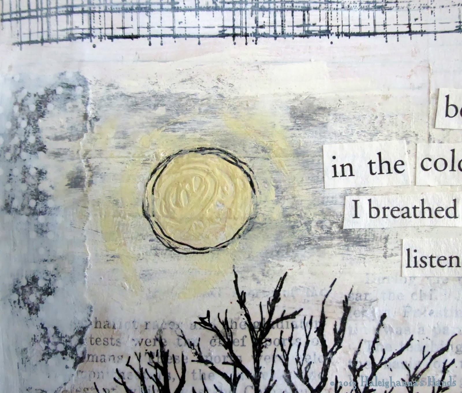
Lastly, I added a little random poetry from two phrases from different books.

What I found challenging about this layout was the play of values. Since I didn't have different colors to add emphasis or texture, it all had to be achieved using color values. It actually required a little discipline to grab a red just to give it punch, but I resisted in the end because that would have stolen my lady’s thunder.

What challenges have you found in your art recently?

Thursday, December 19, 2013

Art Journal Thursdays: I Breathed Again and Listened More Deeply


Even though the Winter Solstice is still a few days away, winter is truly here. The sun is less brilliant, usually hiding behind wispy clouds, shedding cold light over brown grass (which inspired this art journal page). While that seems like it might be depressing, and I know it is for some, I find it peaceful. It seems that everything is at rest.

Acrylic paint roughed up by using the paint brush handle.

I won't say that winter is my favorite time of the year, but it has it's advantages. Winter is a time for short days, full of introspection. Nights by the fire, hearty soups or hot chocolate in hand. Knitted scarves, woolen socks and gloves, and bulky sweaters...it's like wearing home when your are out. Everything slows down.

A Tim Holtz "ledger" rubber stamp was used at the top of the page and then gessoed over it with my finger.

I used random cut out words from a large print book. These words jumped out from the pages...they captured exactly how I was feeling about that day.

Paper scraps, other ephemera and rub-ons with gesso over it.

A hand-drawn tree in winter.

The focal point of the art page is a tree that I drew one afternoon. I copied it, using a laser copier, and then transferred it on to the page using matte medium. I applied the matte medium to the image, turned it upside down on the page and then used an old credit card to smooth out the bubbles. I then used a hair dryer to dry it quickly and then wet the paper and rolled it off with my fingers. It is a great way to incorporate my own hand-drawn images without having to carve a stamp.


What season inspires your artwork the most?


Thursday, December 5, 2013

Art Journal Thursday: He Himself is Our Peace

 
Life has a lot of stuff to it--work, family, relationships, experiences and on and on. It's all those things that make us who we are, right? We all have lovely bits--talent, generosity, compassion, intelligence, etc. We also all have our sucky bits--envy, contempt, irritation, and so on. We can't help it because we are imperfect beings in a fallen world. If I am left to my own, there is no peace. I cannot make right the things that are wrong. I can't do things over. I can only move forward trying to minimize the uncaring things I do and find ways to positively impact those around me.

Multiple layers of acrylic paint applied with a palette knife.

So today's journal page is about layers. It began with scraps of book pages randomly glued to the substrate. Then I began with layers of paint. I began layering several colors of paint and then decided that I didn't like them. So I mixed some black with some gesso and started over.

Gesso and thinned acrylic paint applied to the die cut flowers.

I liked the layers because the it had such a messy quality. But I wanted to add something a bit more joyful to offset the overall darkness of the piece. Using a Tim Holtz Sizzix Bigz die, I cut out several flowers and then adhered them to the page.

Use a Pitt brush pen, size B, to journal and add lines to my flowers.

Sunflower yellow acrylic paint, applied with a palette knife, was created as a background to journal on. I added one of my favorite scriptures. It is a reminder that I cannot obtain the peace I seek alone.

Thursday, November 21, 2013

Art Journal Thursday: The Morning is Wiser

 
As I was digging through my stash, I came across this image of a little girl. She seems so innocent and sad. The photo was taken for another project, but it I found it so inspiring that I wanted to feature her in an art journal page.

This random quote from a book was the perfect caption.

First, I glued down the photo, an old page with short hand symbols on it, and the decorative paper of the vintage children. I also painted the piece, carefully avoiding the images, in Titan Buff (a beige-ish color). Using raw umber and a light permanent green, created this deep forest/olive drab color. I applied the paint over the first layer, and letting it dry for a minute or two, took off the excess with baby wipes (one of my new favorite tools). It seemed too dark so I added a glaze wash of ivory.
The wings are outlined with a gold metallic paint pen.

I gave her wings in keeping with the “forest” feel, giving her a whimsical air. I cut out a crown from a scrap piece of card stock, painted it a mustard yellow and then an antique, metallic gold. I added some glue and then randomly applied glitter.

 
I added some flowers in succession, in a deep bronze metallic ink, again giving the impression of a forest.

I added a small bit a metal to the crown to make it a bit more regal.

Thursday, November 14, 2013

Art Journal Thursday: Fly


There are some things that I don't want anymore. Similar to my recent need to use what I have on hand and weed out the things that I no longer need (i.e., out of focused photos, clothes, art supplies and the like), I decided to look at some emotions that I could do without. I think sometimes we keep thoughts and feelings that used to serve us or came to us legitimately, but have now outlived their usefulness. This page expresses the desire to live out of something else.

I opened my stash of rub-ons to help create texture.

I used a red paint pen to create the "crown" border.

More rub-ons and my handwriting. The letters were rub-ons that I then went back over with a red paint pen.

The background was created using a palette knife, layering on titian buff, black and turquoise acrylic paint.

What things or emotions are you wanting to get rid of in your life?


Thursday, October 31, 2013

Art Journal Thursday: Don't Wait


One of the key themes of my life is the struggle with patiently waiting. Or impatiently waiting for that matter. After I got the composition down, the phrase, "Don't wait until Spring to grow," just keep playing in my head. With the flowers, it seemed appropriate. I didn't question it, I just followed my gut. It wasn't until I started writing this blog that the theme emerged. I guess I am still waiting on something...but I don't know what it is. I guess I'll just have to keep working in my art journal until it becomes clearer or another theme rears its ugly head.

Used a palette knife to spread three different colors over to create the background.

As you know, I keep trying different things. But one thing that I do return to time and again is my palette knife. I like the randomness of spreading the paint; it can be very satisfying to wipe the paint on the page without a clear idea of where it will land. If you don't like it's resting place, you can always add another layer of paint.

The flowers were cut from complementary scrapbooking papers.
 
 
I used the top of a pen to dipped in paint to create these circles.


I created stems and twigs and then used the ripped paper as a hill to ground the flowers.

Using Tim Holtz plastic letters as a template, I painted the words and then added depth by using a brush marker.

Thursday, October 24, 2013

Art Journal Thursday: For I am Going Away


Books are a great source of inspiration. Whether it is the world the author has created or the words that have been artfully crafted together. Books open our eyes to possibilities.

That's why I like to use them in my art journal. I find phrases and use them out of context to create new meaning. That's how this page came together.

The title phrase, "...for I am going away", reminded me of my own journey. Leaving the comfort of a nest that I had built for more than 40 years.

A fitting phrase from an entirely different book.

I found an image and traced it using tracing paper. Then I hand painted it.

I used a dry brush for the background and a piece of a cardstock border as a stencil.

I drew the cloud freehand from a book page and added a little ivory to integrate it.

The inspiration phrase from a vintage children's book.
I'd love to hear how you have used books in your work.

Thursday, October 17, 2013

Art Journal Thursday: Waiting

Waiting is hard.

Waiting is boring.

Waiting can make the heart sick. It wears away...so much.

That was the inspiration for this journal page. A few years ago, I went to Père Lachaise Cemetery in Paris and marveled at the artistry of the memorials. A number of them had started to decay. To fade away.

I recently found one of my photos and it resonated with me. Waiting. Waiting. More waiting. All the while having pieces of yourself fall away. It was a clear picture of what it is like to feel the pain of abuse. I decided to use it as the cornerstone of the page.

Image transfer using matte medium and a laser printer copy of my photo.

But when I was done, it seemed too dark. There is light. There is help. There is compassion, even if there isn't complete healing. So I incorporated the beginning of Psalm 40 into the page. This will help me to remember that help is not far off.


A little of my own poetry (in white) and Psalm 40 in black.

A white marker over the light permanent green and Payne's Gray glaze.

Thursday, October 10, 2013

Art Journal Thursday: Healing

My one of my fondest desires.
 
Healing, no matter how large or small the wound, is something we all desire. We live in a fallen world; a world that delivers pain from glancing blows to fatal trauma. Small lies, the end of a relationship, social injustice--the list goes on and on. It is unavoidable. Once the wound is there, healing is the thing we desire desperately. That's what this page is about.

A random phrase from a book. This is one of my favorite creative prompts.

Don't get me wrong, I know that there is joy in the world. I have seen it. Joy in my husband taking my hand. Joy in laughing with my oldest daughter. Joy in lying in bed reading with my youngest girl. Joy in the soft, brown eyes of my white Schnauzer. And yes, joy in talking about who's going to bite it in the next  episode of "The Walking Dead".

I used a stamp with Tsukineko Brilliance Pigment Inkpad in Moonlight White. 

But, there is a lot of stuff out in the world that hurts. And hurts for a long time. The fondest wish of my heart is not that the pain didn't come, but that the wound would close and scar over. I am okay with my scars. In fact, I would be happy to show them to you. But an open wound, well, sucks. So I desire healing, even if it means having to do the work of cleaning the wound out in order for it to close.

The background is a printed piece of blank newsprint.

Technique note:

I created the background by using a canvas board as a printing plate. Texture was created by making bumps with acrylic paint and letting it dry. I then added layers of acrylic paint in differing colors to the board. I sprayed the paint with rubbing alcohol and then laid a scrap piece of newsprint (saved from a Hobby Lobby glass purchase) on the plate. I used a brayer to make sure the paper was in contact with the plate. Then I rapidly removed it and laid it aside to dry. One of the nice byproducts of this is that the bumps started to dissolve and created added color in random patterns.

Thursday, October 3, 2013

Art Journal Thursday: Abstract to Transformation

 
I have been experimenting with abstracts. Earlier this week I attended an encaustic class and decided to play with my acrylics in a similar way. While it was a lot of fun, I found that I had inadvertently created the shape of a butterfly. I noticed it when I turned the piece on its side. So I decided to finish the shape.

Funny how the unconscious mind creates recognizable shapes while the conscious mind is trying to create chaos.

The butterfly appeared and the abstract just flew away.

I used paper towels to take away the Payne's Gray paint to give some dimension. 

I love the contrasting colors.

I laid down an old book page to dispel the empty page anxiety.
 
I chose this verse because of the transformative qualities. This life is all about refinement, about being moved and changed.
 
If you can't read my writing, the verse is 2 Corinthians 3:18
And we all, who with unveiled faces contemplate the Lord’s glory, are being transformed into his image with ever-increasing glory, which comes from the Lord, who is the Spirit.

Thursday, September 26, 2013

Art Journal Thursdays: The Ache

The farm on a winter day, similar to the last day I saw it.

I loved my grandparents, particularly my grandfather. They lived on a farm in Kansas. On the weekends, I would go there and my grandfather Papa would take me to the candy store, let me drive the tractor, and listen to me prattle endlessly about little girl things.

Papa unconditionally loved me.

In 1976, they had to sell the farm to make way for a dam. It was a very sad time. They used the money to move to a warmer climate and enjoy their retirement without the threat of snow.

The move was terrible sad. Now that I have done something similar (i.e., moved across the country to follow a dream), I find that I am even more nostalgic. I ran across this picture during my unpacking and it moved my heart. Before I left Kansas City, a dear friend and I went down to the farm. While it is now under water, I can still make out the ruts from the gravel road that took me to the place where there was so much love.

I truly do ache to go back to that place.

I used acrylic paint over a colored photo copy of the house. I wanted to capture the house exactly while incorporating it into the entire composition.

I used old book pages as the base of the page. I used a palette knife to make scrape the clouds across the uneven pages.

My handwriting on an old book page.

The original photo on which the page is based.